ui5-typescript-walkthrough
Step 11: Pages and Panels
After all the work on the app structure it’s time to improve the look of our app. We will use two controls from the sap.m library to add a bit more “bling” to our UI. You will also learn about control aggregations in this step.
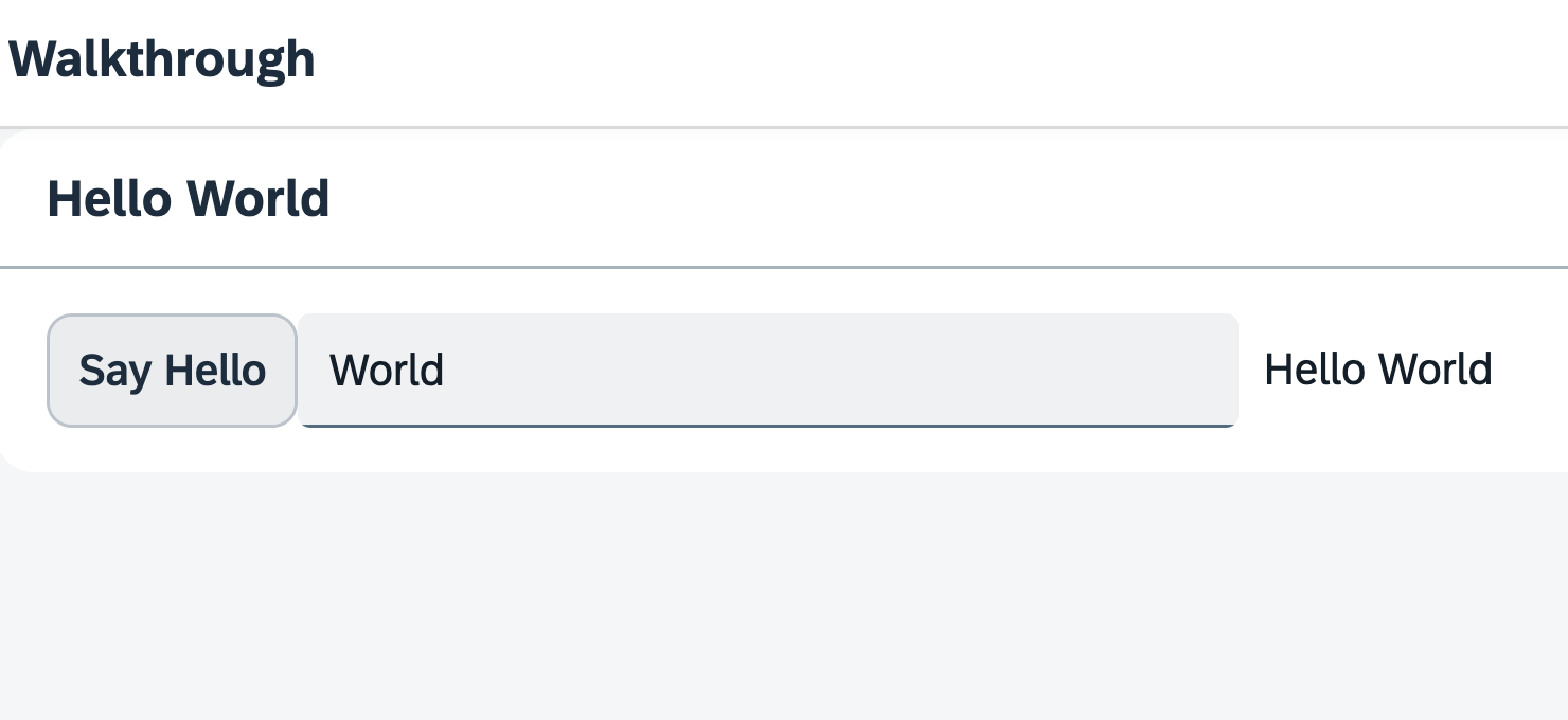
Preview

A panel is now displaying the controls from the previous steps
You can access the live preview by clicking on this link: 🔗 Live Preview of Step 11.
Coding
webapp/i18n/i18n.properties
We add new key/value pairs to the ‘# Hello Panel’ section of our text bundle for the start page title and the panel title.
# Manifest
appTitle=Hello World
appDescription=A simple walkthrough app that explains the most important concepts of OpenUI5

# Hello Panel
showHelloButtonText=Say Hello
helloMsg=Hello {0}
homePageTitle=UI5 TypeScript Walkthrough
helloPanelTitle=Hello World
webapp/view/App.view.xml
In your App view, we put both the input field and the button inside a containing control called sap/m/Page. The page provides an aggregation to 0..N other controls called content. It also displays the title attribute in a header section on top of the content. The page itself is placed into the pages aggregation of another control called sap/m/App.
In order to make the fullscreen height of the view work properly, we add the displayBlock attribute with the value true to the view. The actual content is wrapped inside a Panel control, in order to group related content. It displays the headerText attribute in a header section on top of the panel.
<mvc:View
   controllerName="ui5.walkthrough.controller.App"
   xmlns="sap.m"
   xmlns:mvc="sap.ui.core.mvc"
   displayBlock="true">
   <App>
      <pages>
         <Page title="{i18n>homePageTitle}">
            <content>
               <Panel
                  headerText="{i18n>helloPanelTitle}">
                  <content>
                     <Button
                        text="{i18n>showHelloButtonText}"
                        press=".onShowHello"/>
                     <Input
                        value="{/recipient/name}"
                        description="Hello {/recipient/name}"
                        valueLiveUpdate="true"
                        width="60%"/>
                  </content>
               </Panel>
            </content>
         </Page>
      </pages>
   </App>
</mvc:View>
The App control does the following important things for us:
- It writes a bunch of properties into the header of the
index.htmlthat are necessary for proper display on mobile devices. - It offers functionality to navigate between pages with animations. We will use this soon.
📝 Note:
Thesap/m/Pagecontrol used here is one of the most popular view-level containers in OpenUI5. However, OpenUI5 applications are used in different environments: they can be embedded within shells that come with their own header (like e.g. SAP Build Work Zone or the SAP Fiori launchpad). Or they are displayed stand-alone without such a shell around them. This has implications on how the header area of a OpenUI5 application should look:
- A stand-alone OpenUI5 application could use a
sap/m/Pagecontrol as root control of its views. This Page control provides a visually distinguished header bar with a title and has a built-in “back” button using which the user can navigate back to the previous page. (This back button can be enabled by setting the Page’sshowNavButtonproperty totrue.)- When, on the other hand, a containing shell already comes with a header that has a “back” button and a title, then using
sap/m/Pagecontrols will lead to duplicate headers (and possibly even duplicate back buttons). Thesap/f/DynamicPagecontrol would be a preferred alternative in such a scenario, as it comes without a header bar and back button, but still offers the option to configure a title if needed – and many other features on top of a plainsap/m/Page. Further alternatives aresap/f/semantic/SemanticPageandsap/uxap/ObjectPageLayout, depending on the use-case. Note that they are part of other control libraries than sap.m, so you might need to add the respective library to your application setup. For some scenarios, thesap/tnt/ToolPagemay be another alternative. But also thesap/m/Pagecan be configured to have its header hidden.
So while this tutorial uses a
sap/m/Page, it’s important to be aware of the above considerations when developing applications. For further guidance, refer to the SAP Fiori for Web Design Guidelines regarding Page Layouts and Floorplans.
Next: Step 12: Shell Control as Container
Previous: Step 10: Manifest (Descriptor for Applications)
Related Information